Yes, we all hate gray right now – but it seems we all agree that this Sherwin-Williams trending paint is the perfect balanced gray we can’t part with
When it comes to neutral colors that feel both stylish and effortless, Sherwin-Williams’ best seller, Repose Gray, makes the shortlist. A soft, welcoming greige with just the right amount of warmth, it offers a calm, contemporary foundation for interiors that crave a bit of quiet elegance.
Whether you’re updating a whole home or refreshing a single space, Repose Gray has the kind of versatility designers look for in a gray shade. So, if you’re on the hunt for the best gray paint that can carry a room with understated charm, this hue deserves serious consideration.
And while decorating with gray can sometimes feel a little clinical or flat, Repose Gray avoids that entirely. Its balance of warm and cool undertones makes it surprisingly flexible, being easy to layer with color, texture, or pattern without overwhelming a space.
With expert insight from Emily Kantz, Color Marketing Manager at Sherwin-Williams, we take a closer look at Repose Gray SW 7015 to explore how it looks in different lighting, where it works best (and where it might not), plus how to pair it with other shades to get the most out of its refined color.
How to decorate with Sherwin-Williams Repose Gray
Repose Gray has become a favorite among designers and homeowners alike thanks to its adaptability. It’s a true greige paint – sitting comfortably between warm and cool –that plays nicely with most interior color palettes.
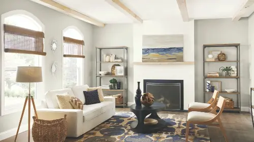
According to Emily Kantz, ‘Repose Gray’s versatility makes it an ideal color for creating a cohesive look throughout the home. Its balanced tonality allows this tone to create a serene and sophisticated atmosphere, great for living rooms, bedrooms, and kitchens.’ It also provides a neutral backdrop that lets furniture, art, and architectural details shine.
If your space is blessed with natural light, Repose Gray will absolutely thrive. ‘Rooms with plenty of natural light or good artificial lighting can showcase the beauty of Repose Gray, creating a feeling of subtle softness and comfort within a room,’ says Emily. It’s the kind of color that makes a room feel put-together without trying too hard – ideal for open-plan living rooms or bedrooms that double as sanctuaries.
In contrast, spaces with lower light levels will bring out Repose Gray’s moodier side. Emily advises that ‘in spaces with limited natural light, Repose Gray can look darker and more muted,’ resulting in a slightly darker appearance.
This can work wonderfully well in smaller spaces like powder rooms or offices to add depth. However, to prevent things from feeling on the heavy side, and stop it from making the room feel unhappy, pair it with light-colored furniture, reflective finishes, or crisp white paint on the trim to help bounce light around and balance the space. As always, testing in your specific lighting conditions is key, so make sure to test with a color sample before fully committing.
What colors go with Repose Gray?
Repose Gray and its easy-going nature when paired with other colors means it pairs effortlessly with both bold accents and subtle neutrals. For a crisp, clean contrast, Emily suggests pairing it with Pure White SW 7005, which adds a fresh edge to trim, ceilings, or cabinetry.
If you’re after something deeper and moodier, Naval SW 6244, a rich navy, offers a dramatic foil that still feels timeless. Meanwhile, to achieve a warmer space, earthy tones like Redend Point SW 9081 or soft green-gray Evergreen Fog SW 9130 bring a cozy, layered vibe to the room.
If you’re leaning into a more tonal, subtle look, try complementary neutrals like Pavestone SW 7642 or Anew Gray SW 7030. These create a harmonious, relaxed feel that’s perfect for casual spaces where comfort is key.
Is there any rooms to avoid using Repose Gray?
Though Repose Gray is a famously versatile color, there are still a few scenarios where it might not behave as expected. Emily advises, ‘There are rare instances when Repose Gray does not work, such as a room that has north-facing windows. This cooler light can make Repose Gray appear more blue or green.’
This isn’t necessarily a dealbreaker, but it can catch you off guard if you’re expecting a true warm gray. Emily recommends testing a color chip or sample in the actual space before committing. It’s a simple but essential step to ensure Repose Gray’s undertones work with the natural lighting in your room, rather than against it.
If you aren’t planning a big paint project, bring the soft, balanced tones of Repose Gray in smaller accents with these home decor pieces.
Comments are closed.